Case Study
https://fmidnight.com/design

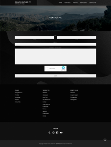
Design, A Portfolio Site
A portfolio site designed to convey a clean, crisp, and creative tone. This site is designed to be professional and focuses on easy navigation and central focus. I envisioned this site to function much like a frame on a piece of art in a museum; the frame cannot be too elegant as to draw attention away from the art, but also must be worthy to hold the art the frame contains.
Client/Audience
The client for this site is a little more abstract, as I am not designing for a specific person or company, but rather a future entity that may wish to hire me. I do know that my audience will be in a field of web design or development, and therefore knows the ins and outs of the job. Therefore, I want to make a site that is clean and crisp, but also has personality. I can distinguish my work with my own personal flair, while also maintaining a clean and presentable aura.
Challenge
There are two major challenges with this site. One is that I am designing for an entity I do not know yet, the other is that I must balance cleanliness with creativity: not making the site too busy as to draw attention away from the portfolio, but also creative enough to demonstrate my design abilities.

Solution
In order to address the two presented challenges, I will start off with a clean white theme and work from there. I want to balance creativity with cleanliness by using many background colors and one accent color. I plan to add the creative flair with animation and imagery from my portfolio. I will also draw attention to my portfolio work by using it in the banner for each page.

Results
I ended up using indigo as my accent color, and employed fading and transition animations to convey personality. The result was what I intended: a clean, professional website that focused on the content over the design.
Typography
I thought the theme default of Railway was an excellent choice for the header. It is elegant, readable, and professional. Open Sans with a Helvetica backup was also a good choice for the body, as it was also readable and professional.
Animation
Using CSS animation, I added a fade in for each banner title, and a transition animation for the banner itself. This added a flair to each page that displays my work in a creative way, while not being too over-the-top or distracting.
Color Scheme:
| Header | light gray | (#d8d8d8) |
| Accent | indigo | (#8215ca) |
| Body | off white | (#efefef) |
| Footer 1 | black | (#050505) |
| Footer 2 | dark gray | (#111111) |
| Footer 3 | gray | (#222222) |